NICAR-L is a mailing list focused on computer-assisted journalism. Members often alert the list to job openings that might be of interest to other subscribers. Since I subscribed, 79 job openings have been announced. I recorded them in a spreadsheet, along with the relevant hiring institutions, job descriptions, and geographic locations.
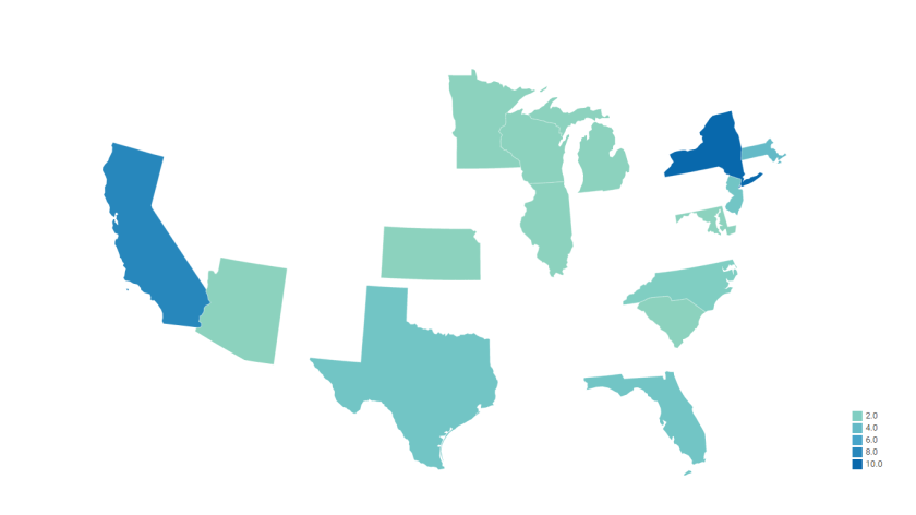
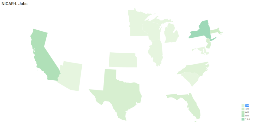 At first, I used a different version of the map showing the states in which job opportunities were located. The states that had job openings were represented in somewhat bolder colors than those seen here, but having omitted the jobless states, I felt that a more subdued color scheme would do a better job of conveying that some of the states that had job openings had only one or two. More generally, I think the use of lighter colors underscores the small size of the dataset I used to generate this visualization.
I would also note that a small plurality of job openings (16 positions) were based in Washington, D.C. Those positions aren’t included in this visualization because, due to its small size, D.C. wasn’t visible on a national map. (Or at least it wasn’t visible on this one, which I generated with Datawrapper.)
Obviously, job openings outside of the continental U.S. aren’t featured here, but there were a few, mostly in Germany and Canada.
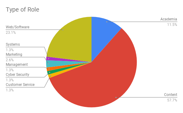
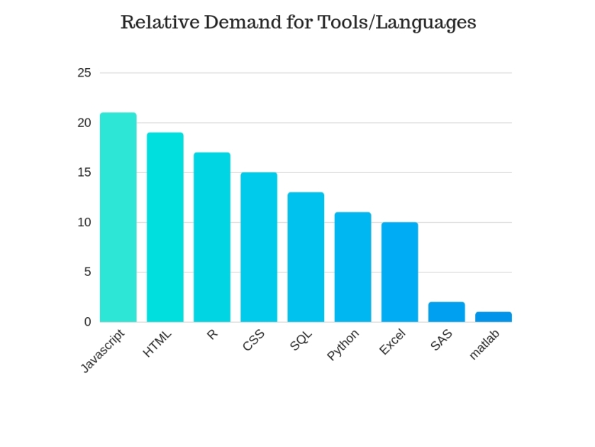
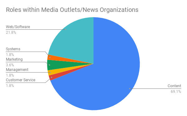
With respect to organizing jobs by “Type of Role,” I think I should explain my approach. I tried to make my categories few in number and relatively comprehensive, rather than numerous and hyper-specific. Naturally, some jobs could have probably been placed in more than one category. For example, many jobs that deal with designing visualizations and developing interactive applications sit at the intersection of content creation and web development. In cases like this, I used my best judgement based on the job description without sticking to any hard rules, reasoning that a foolish consistency might skew the results in a way that the odd misclassification wouldn’t.
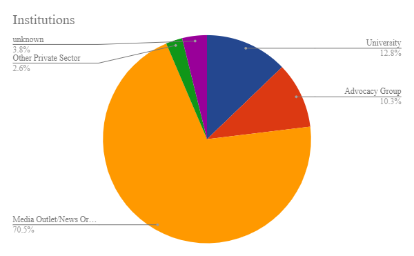
Some job announcements mentioned multiple positions, and each position was included separately. Consequently, different types of institutions are represented here according to the number of times an institution in a certain category announced a position, not the absolute number of institutions in that category. In practice, this shouldn’t change the breakdown very much, but it does present a clearer picture of where jobs are actually available.
A large majority of jobs announcements promoted positions at media outlets and news organizations. This is no surprise given the list’s subject matter and readership. Media outlets also boast of hiring, or attempting to hire, a more diverse range of data professionals than any other type of institution represented in this (very small) sample.
One could argue that this diversity is due simply to the media’s predominance among NICAR-L job announcements, and there’s probably some truth in this, but in some ways media outlets really do seem to differ from other types of institutions in their recruiting goals.
Universities were the second largest institutional recruiters. Predictably, the positions they were trying to fill were almost invariably academic roles. Then again, academics often vary considerably in their areas of interest and expertise, so it’s possible that the same couple of academic titles which appear in listing after listing undersell the diversity of the talent pool universities wish to reach.
Still, media outlets, being in the business of creating content and presenting it to a popular audience, seem to have much more specialized needs, and this is reflected in the types of professionals they seek to hire.